Regional Insurance Platform: Complexity into Confidence
Tokio Marine Holdings • Sep 2019 – Sep 2020
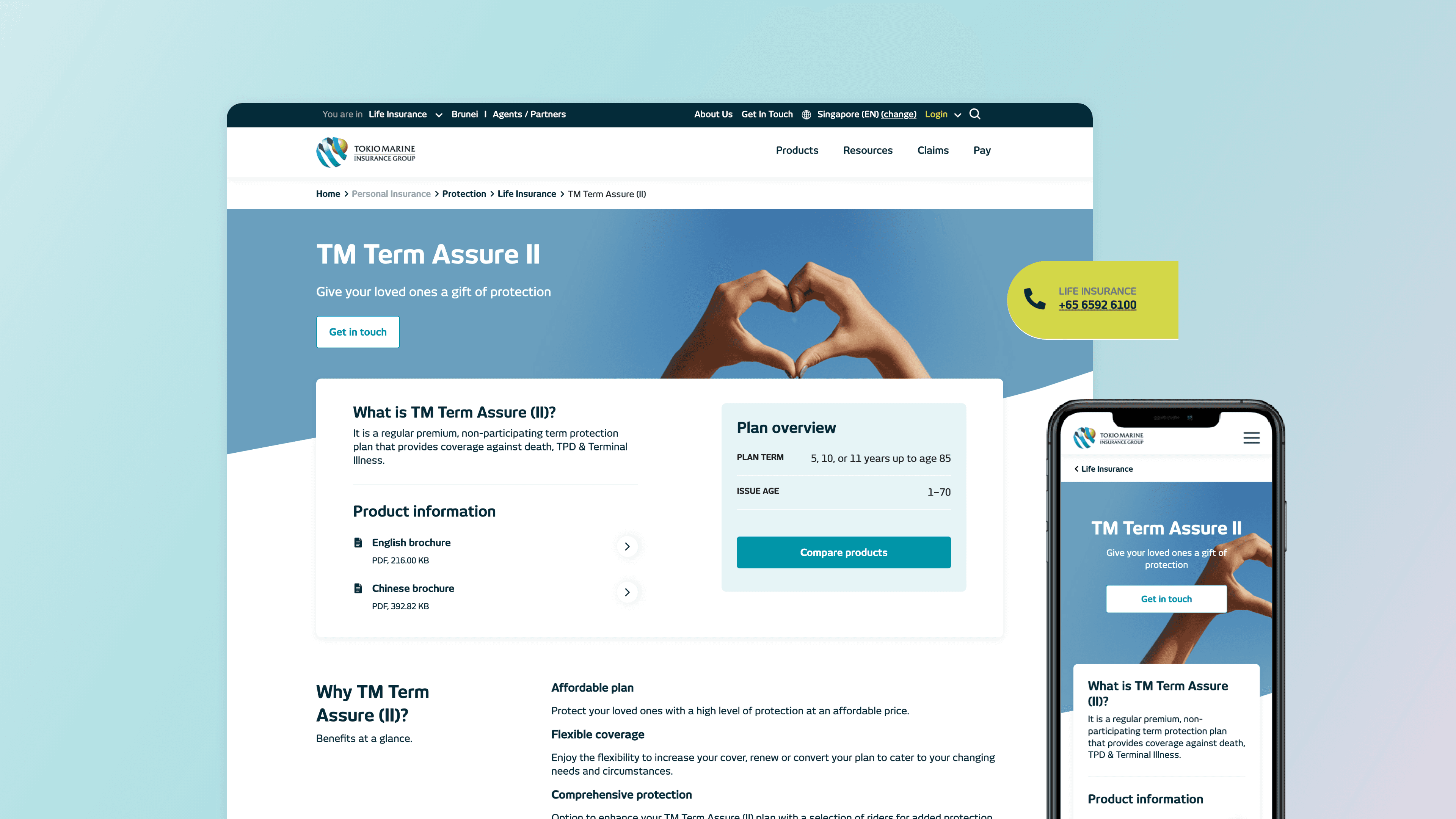
More competitors, declining digital sales, an 8-year-old site that couldn't keep up. Something had to change.
iMPACT
63%
higher engagement
19.5%
lower bounce rate
6
SEA markets
MY ROLE
Lead designer
End-to-end design, from discovery to UI execution. Introduced UX research and cross-market usability testing to shape IA and content strategy across 6 regional markets. Aligned stakeholders and clients from discovery through delivery, collaborating with SEO experts and a UX writer on navigation and content.
TEAM
Project managers, SEO & UX content experts, developers, designers.
PROBLEM
Customers lacked clarity and confidence when navigating insurance products.
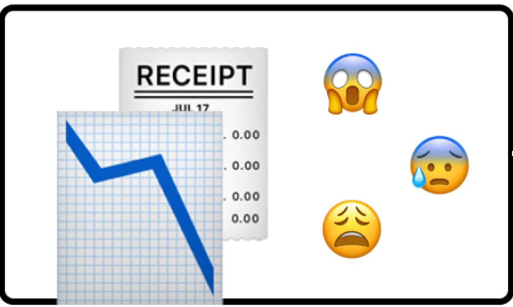
Digital sales were declining.

Competitors were catching up.

8yo site overdue for a refresh.
KEY FINDINGS
Audited site SEO, content, UX and analytics to uncover insights behind declining digital sales.
Confusing navigation
The primary nav had small clickable areas and unclear structure. Users couldn't find what they came for.
Poorly structured content
Information was duplicated and poorly sequenced, leading to fatigue before users reached a decision.
Corporate jargon
Terms like "Protect," "Save," and "Wealth" didn't match how customers thought about insurance. Products were hard to find and harder to differentiate.
Remote user study across 6 SEA markets
Mismatched
expectations
“Help & Support” is perceived as customer service rather than a resource for locating affiliated clinics or workshops, challenging the assumption that a single entry point would improve access.
Customers remember policies by type, not name.
Customers often remember the type of policy they purchased but not the specific policy names, frequently requiring them to refer back to physical documents.
Urgent tasks need immediate answers
Customers feel reassured when they can quickly access information for urgent tasks, such as locating car workshops or filing claims.
How might we effectively engage users and provide reassurance before and after insurance purchase?
SOLUTION
Redesigned insurance website with updated information architecture, structure, visuals, and content strategy.
01.
Room to explore, easier to find
Navigation now offers expanded interaction space with quick access to essential hotlines and entry points across the site.
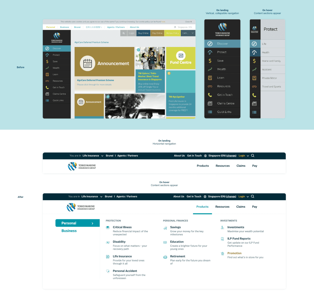
Old navigation (top) and new navigation (bottom)
02.
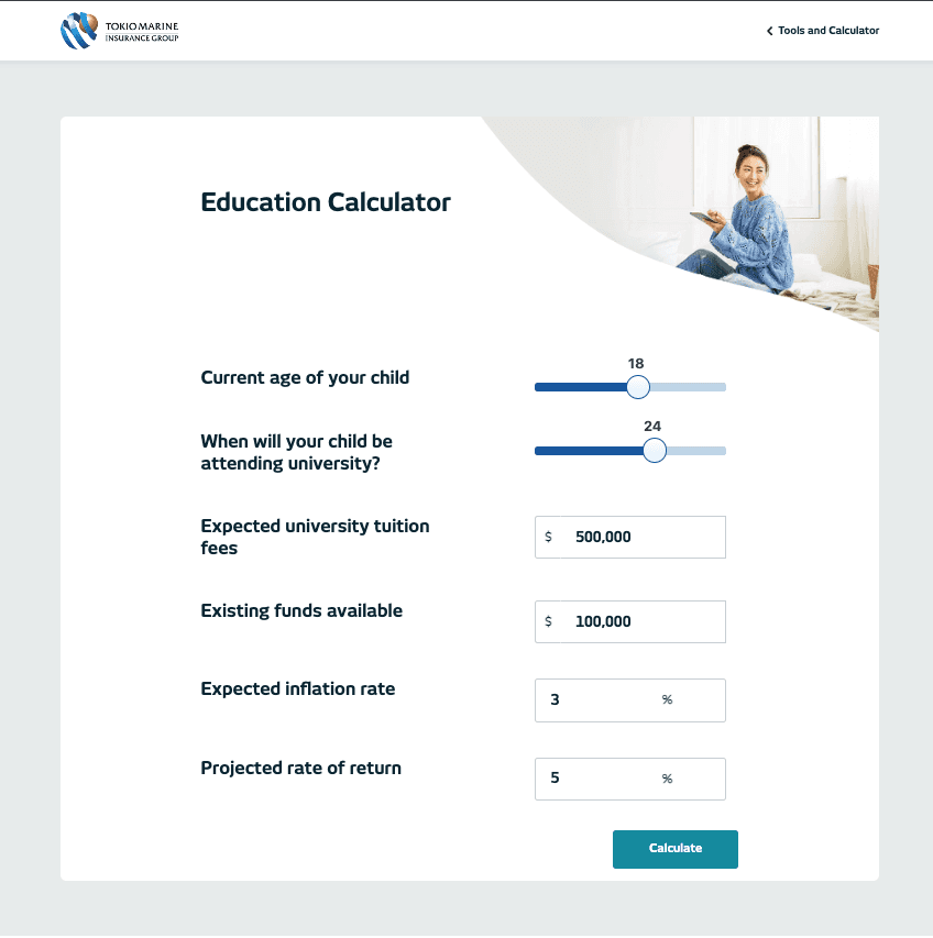
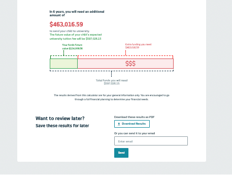
Personalised tools to make informed decisions
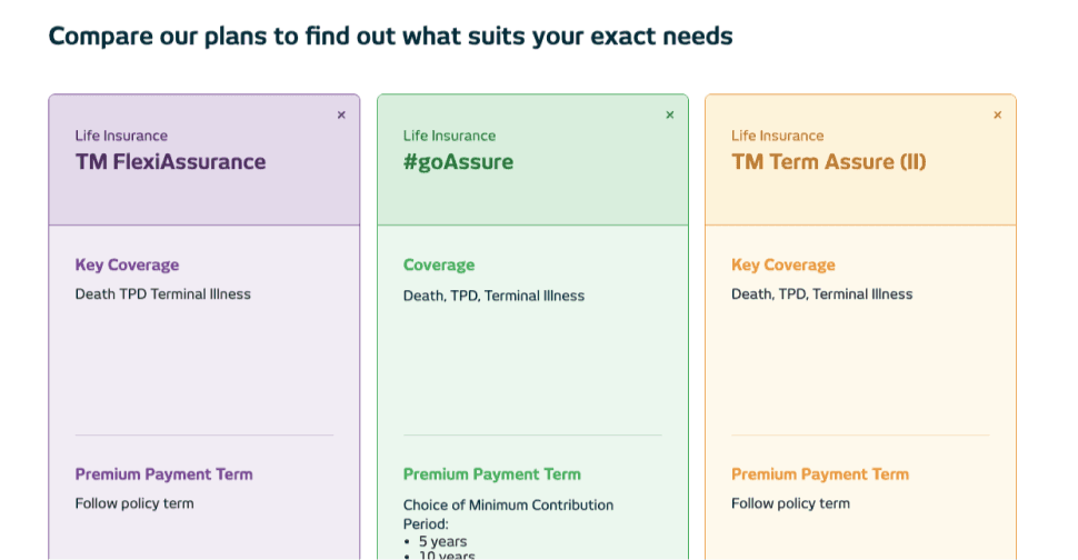
Comparison tools and goal-setting calculators help customers assess options and understand what's right for them before committing.
03.
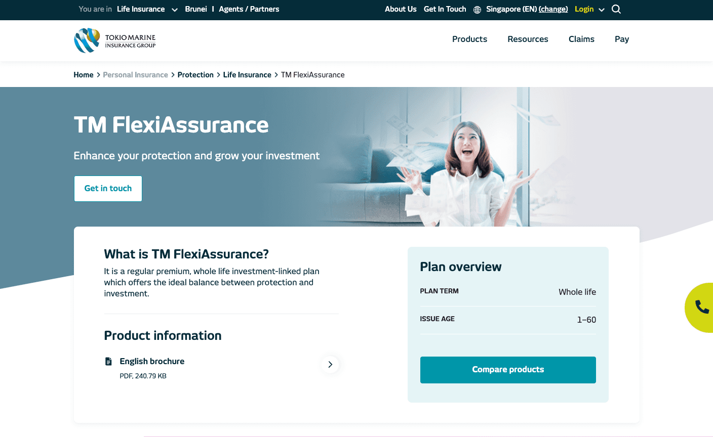
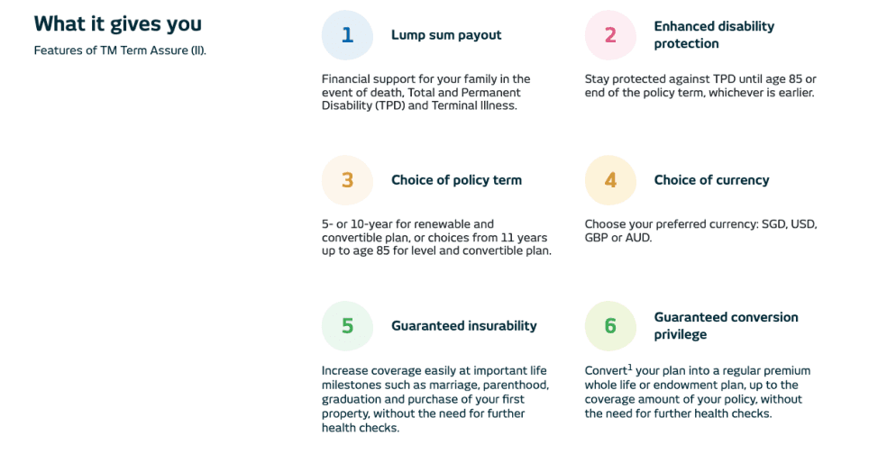
Critical information, brought forward
Vital policy details — plan term, age eligibility — are surfaced upfront. User-focused headings replace corporate language throughout.
04.
Answers where customers need them
Product categories and quick links on the landing page, plus an FAQ, so customers get answers without digging.


Before (top) and after landing page (bottom)
04.
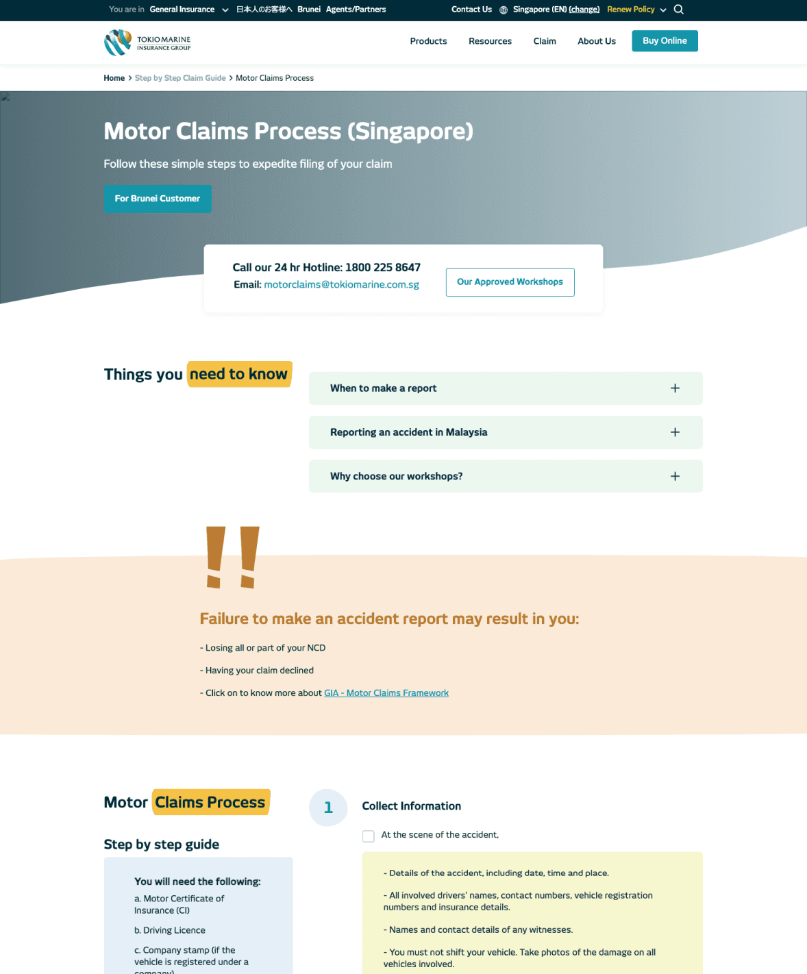
Making the claims process less daunting
Clear instructions, required documents, timelines, and expected outcomes. All laid out before customers need to ask.
iMPACT
63% higher engagement, 19.5% lower bounce rate
Users who previously landed and left were now staying and exploring. The IA overhaul and content restructure gave people a clearer path through a product category that most find genuinely confusing and the numbers reflected that.
Rolled out across 6 Southeast Asian markets in October 2021.
REFLECTIONS
Alignment across markets isn't just stakeholder management
Six countries meant six sets of priorities. Going back to the research kept everyone aligned. A scalable country template helped too, and made disagreements concrete rather than abstract.
Insurance is confusing by design
Insurance copy is written for the business, not the person buying it. The jargon, the product names, the claims process. None of it maps to how customers actually think. Turns out clarity converts. The numbers reflected it.