Redefining mobile payments
Revamping the mobile app payments experience to increase user satisfaction

Context:
OCBC Bank is a Singaporean multinational banking and financial services corporation. The transfers and payments flow on the digital banking app had been in use for 4 years, and was one of the few remaining app features that was still using a dated UIUX interface as part of the the legacy system.
Client:
Oversea-Chinese Banking Corporation (OCBC Bank)
Project Duration:
June 2022 – August 2024
My role:
As part of a 2-person design team, I played a key role in completely redesigning the app’s payment experience.
This involved collaborating with product owners, business analysts and developers to define customer journeys, develop UI screens, conduct usability tests, and implement digital solutions within technical constraints.
Goals:
To redesign the transfers and payments flow such that it is
Engaging
Seamless and easy to use
Reassuring and familiar to users
Impact:
Redesign of mobile payment experience, facilitating seamless transactions for over 40 million merchants across nine countries, earning industry recognition as the 'Mobile Banking & Payment Initiative of the Year 2024’.
Expanded digital wallet offerings, reaching 1.3M users in 47 markets, resulting in a 700% rise in cross-border transactions and a 500% growth in transaction volume
Understanding the problem
Inconsistent and dated UI made it difficult for users to understand and get familiar with
The transfers and payment screens had contrasting design languages compared to other app flows, which has since been updated.
This caused confusion for users who have to learn new processes when UI elements and navigation patterns are not consistent.
Insufficient and delayed feedback led to user frustration and wasted time
The transfers and payments flows lacked frontend validation, causing customers to receive feedback only after completing the entire flow. Users could potentially waste significant time and effort entering and reviewing transfer details only to find out later that their transfer was invalid.
Unfamiliar banking terminology causes confusion and hinders understanding
Bank terminologies, such as OneToken (authentication methods) and FAST, GIRO or MEPS transfers (payment types), were used without clear explanation for the users, leading to confusion and difficulty in understanding the process and implications of their selections.
Validating our hypothesis
Discovery
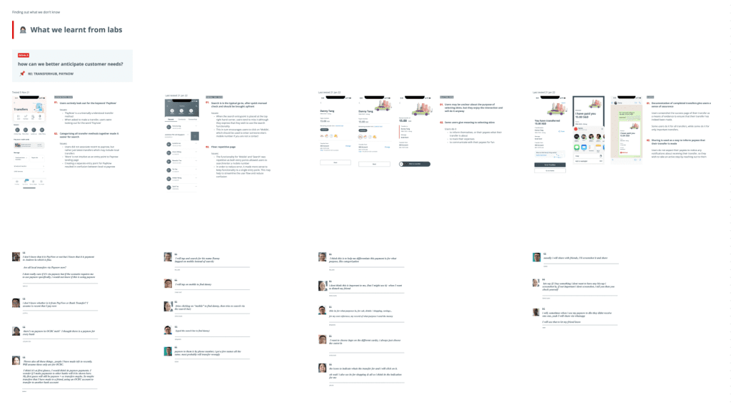
Customer lab sessions were held biweekly to gain insights on users’ banking behaviours and mental models.
The sessions revealed that app users prioritise task-driven functions, such as viewing transaction history or making transfers and payments, while reserving desktop usage for more detailed tasks from reviewing credit card statements to researching bank products.
As a result, customers want the app’s transfer services to be fast, clear, and hassle-free.
Identifying user opportunities
“What product do you offer?”
How Might We design a transfers experience that is clear and easy to use?
“What’s the difference between the products?”
How Might We anticipate user needs to guide them through the transfers process and ensure they feel reassured at every step?
“How do I get help if I face problems?”
How Might We create a delightful transfers flow that leaves users feeling happy?
Ideation

Improve discoverability of frequently used features

Offer guidance and information to support customers in their journey

Introduce customisation options to add a touch of fun
User testing
Through user testing, the team wanted to verify usability of the proposed transfer pages and flows.
Findings
“Transfers” are not readily associated to payments, but account transfers only
Although both “Transfers” and “Payments” involve the movement of money, customers did not readily associate payments with transfers, and were looking for the word “Pay”.
Customers expect to see frequently used options upfront
The team assumed that categorising by “Local transfers” and ”Overseas transfers” would guide customers to find the relevant payment reels under each option.
However, customers often mistook ‘Local Transfers” to be account transfers only and were actively looking for ‘PayNow’, a local mobile number transfer option which was more commonly used. Not showing it upfront led to a less than ideal impression of the bank’s capability.
Interactive elements may be fun, as long as they are optional.
Most users are unclear about the purpose of selecting skins, but enjoy the interaction and would do it anyway. Some users however, see selecting skins as a way to inform themselves or their payee of what their transfer is about, to categorise and track their expenses or to simply communicate with their payees for fun.

Our Final Design Solution
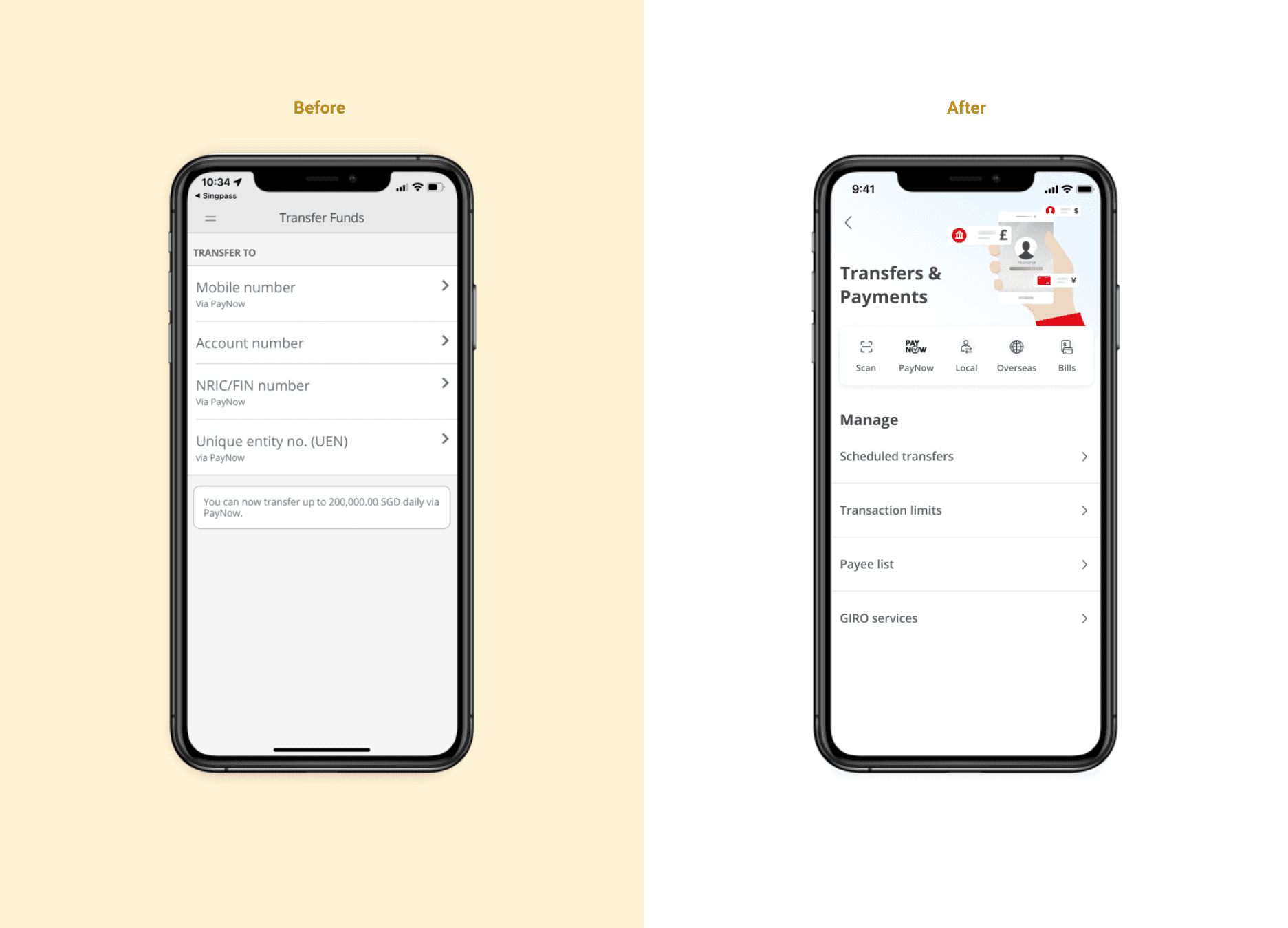
A consolidated transfers hub to easily locate and access transfer services and settings
All transfer services and settings are now consolidated under “Transfers & Payments”. Previously, transfer services were dispersed across multiple sections, leading to confusion and frustration among customers.
Consistency across transfers and payments flows for ease of use
Similar transfers and payments processes are made consistent to create familiarity and control for users, reducing the need for them to relearn new things. This results in faster and easier usage with lesser friction.

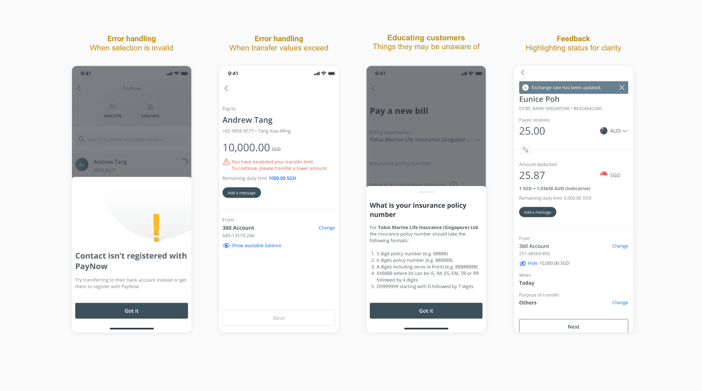
Including prompt guide and feedback to provide reassurance and support
Customers are now prompted with validations while they make a transfer so that they can immediately verify and correct errors instead of restarting their transaction after they try to submit. For example, we inform customers when they exceed their transfer limit for the day or when the PayNow mobile number they are trying to transfer to is invalid .
Information that may help to educate customers are also provided in plain language so that they can understand easily- such as what they should enter as a bill reference number.
Optimising scheduled transfers
A scheduled transfer can be done now by entering the start and end date via a calendar view. Previously, customers had to enter their number of transfers but many often were unclear and had to calculate manually.
As identified from customer labs, some common recurring transfers do not have an end date such as transfers to pay for subscription plans or allowance to their parents. With that in mind, we now allow customers to add a recurring transfer with no end date.

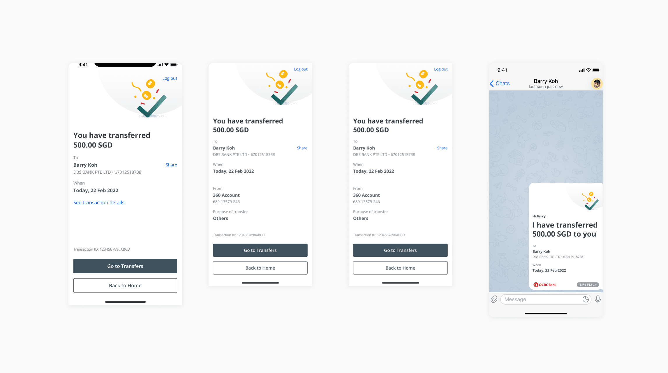
Convenient sharing of transaction proofs to payee
Learning from customer labs, we discovered that customers feel reassured when they have screenshots of the bank app as proof of transaction. Customers may now share transaction details as an image instead of a text message. For privacy reasons, only essential data is populated on the image and shared to payees.
Results
The updated transfers and payments flow will be released in stages, with the initial launch in Dec 2022 reaching 1.3 million users, and a complete redesign of all outdated interfaces expected to be completed by 2023.
Learnings
Consistency is important for both customers and the business
Revamping all transfer and payment flows in one go was not feasible, thus consistency across different flows became crucial to avoid a disjointed customer experience. We soon discovered that consistency also facilitated easier development and collaboration within the business and development team, leading to the creation of a master file documenting components and content variants across all flows.
Work
About
Resume
